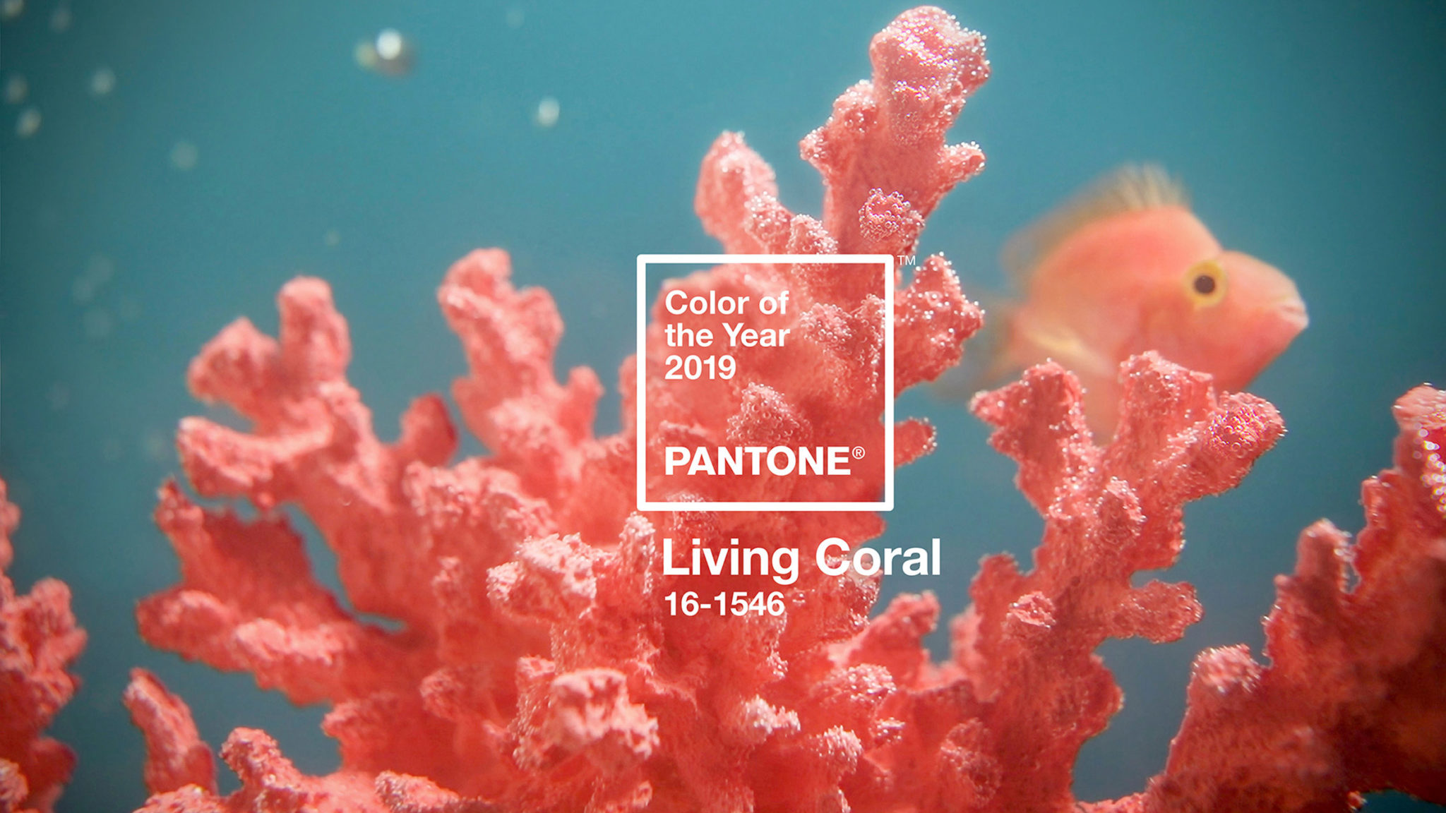
10 Dec Living Coral: Pantone chooses 2019 colour of the year
The official 2019 colour is not just about a charming and warm pink. Pantone official describes Living Coral as a warm and welcomingcolour, but versatile and life-affirming.
As per every year, the election of the Pantone colour affects in a direct way to art & design; flooding from street fashion and haute couture, to interior design and decoration. So that, this colour will be the total protagonist for 2019, starring all kind of creative projects.
Next year´s Pantone its surprisingly the colour of the underwater reefs hanging on for dear life. The colour of the sky at dusk. A bright and powerful tone that has a great importance in the natural world. Where some natural resources as the coral are in serious danger of disappearing.
But this neon bright saturated tone is also a great reflection of the current society, full of social media leaks and with a high digital impact. An artificial universe where the tone has a big presence because of its saturated bright tone.
Two different world wich will make a great difference when using it for sure. What is a fact is that Living Coral is a beautiful and vibrant colour that shows such opposing ideas and realities. A colour that expresses the sensitivity of the natural world in contraposition of the man-made tecnologies. Choosing it as 2019 colour of the year, Pantone continues with the overwhelming trend of distinguishing a high saturated tone with multiple meanings. The commencing 2019 will be a colour explosion coming right after the 2018 Ultraviolet and 2016 Greenery tones. An unwritten bias that came to stay some years ago and that still keeps trendy all the objects we are surrounded by.